Expression Viewer Output
The output of the expression atlas offers several ways to visualize the expression data and to download the results:
- 3.1 Expression cube
- 3.2 Expression bar graphs
- 3.3 Heatmap
- 3.4 Scatterplots
- 3.5 Downloading the results
At the top of the output page (Figure 1) is the query gene name and its functional description.
Under the query gene information there is an input box where the input gene name can be changed,
in order to re-run the expression analysis using a new gene, but with the same conditions as the previous analysis.
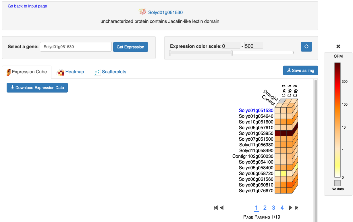
Figure 1. Expression cube output.
3.1 Expression cube
This output consists of a 3D cube where the top layer displays the expression data for the query gene
(gene name shown on the left of the cube in blue)
and the layers below correspond to the genes with the most similar spatiotemporal expression profiles (Figure 1).
At the bottom of the cube there is a page menu to visualize more genes.
On the right of Figure 1 a legend shows the expression values for the color scale.
On the top of the expression cube (Figure 2) are the stages or time points, sorted in time from left to right.
On the left of the cube top layer, the tissues/treatments are listed from top to bottom.
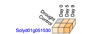
Figure 2. Top layer of the Expression Cube.
The expression cube is interactive. When the mouse cursor is moved over a gene names,
the gene description and correlation value (based on the co-expression with the query gene) will be displayed (Figure 3).
Clicking on a gene name will split the cube to show the expression layer for that gene (Figure 3).
Clicking again on the gene name will collapse the cube again.
Multiple gene expression layers can be displayed simultaneously, so the expression of several genes can be compared.
When the cursor is moved over the tiles of the cube, the expression value for that highlighted sample type is shown.
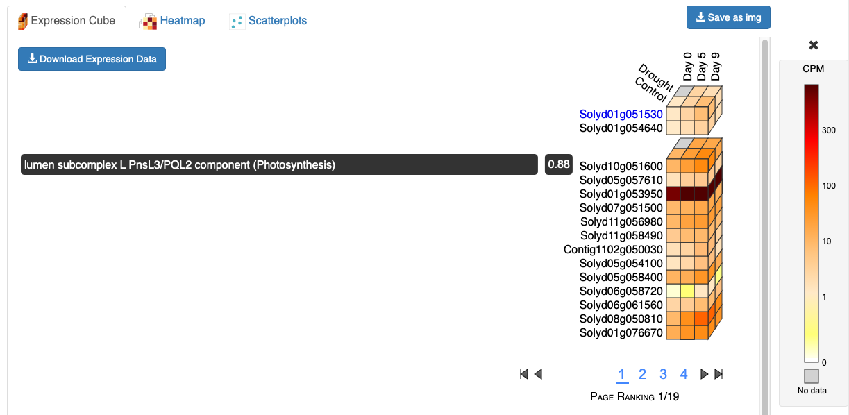
Figure 3. Expression Cube split in two showing description and correlation for a gene.
3.2 Expression bar graphs
Clicking on any tile from the expression cube will open a bar graph to show the expression values for that gene (Figure 4). Error bars are shown indicating standard error of the mean. Bar plots can be opened for many genes simultaneously to compare their expression. By default, tissues are shown on X axis and stages are shown as bars of different colors; however, clicking on the transpose button will change the X axis to show stages and the tissue/cell types will be shown as bars (Figure 5).
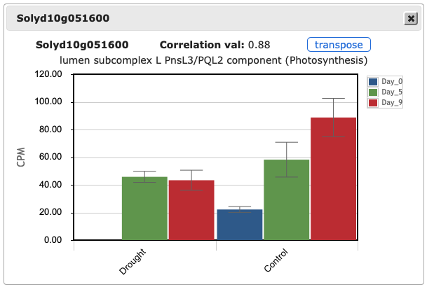
Figure 4. Expression bar graph.
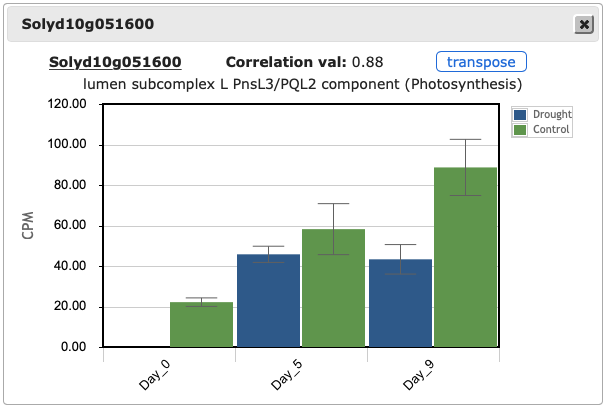
Figure 5. Expression bar graph with factors transposed.
3.3 Heatmap
An interactive heatmap clusters the genes and conditions using a distance tree.
Moving the cursor over the tiles will show conditions and expression values for that gene.
Selecting a region of the heatmap using the mouse will allow the user to zoom in to that region.
Clicking again on any tile will zoom out to display the whole heatmap again.
Clicking on a gene or condition will highlight it on the heatmap.
This heatmap was implemented using the library d3heatmap.
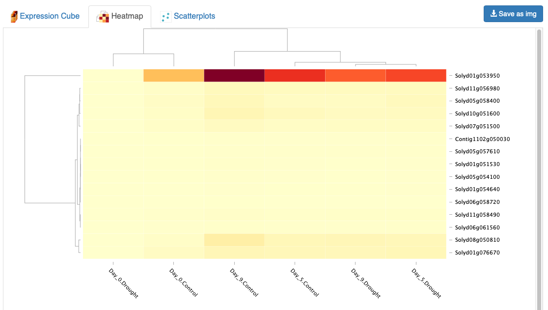
Figure 6. Heatmap
3.4 Scatterplots
The scatterplot tab enables the user to make pairwise comparisons between two samples. The user first selects two samples using the selector, which represents to top side of the expression cube (Figure 7). By selecting two samples and clicking Get scatterplot, the user will be provided with a scatterplot of expression values for all genes in the selected samples (Figure 8). The identity of genes in the scatterplot can be seen by mousing over points in the scatterplot. Zooming in on the scatterplot can be achieved by clicking and dragging the mouse over the desired area. Resetting the magnification is accomplished by clicking on the plot. The scatterplot selection can be reset by clicking New scatterplot.
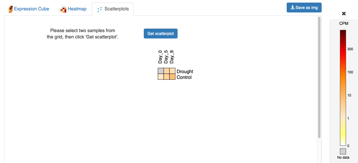
Figure 7. Scatterplot selector
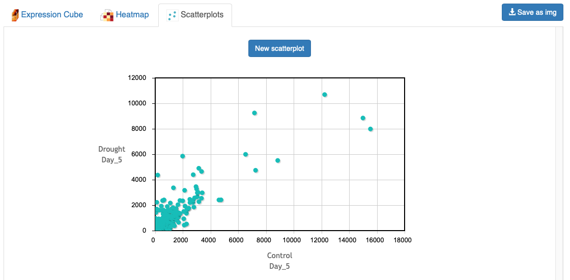
Figure 8. Scatterplot output
3.5 Downloading the results
There are two ways to download the results from the expression atlas.
First, the expression cube and the expression images can be downloaded
clicking the save as img button on the right of the tabs
Expression Cube and Heatmap (Figure 1).
This button will download the images from the active tab exactly in the state they are displayed when clicking the button.
The downloaded images have a transparent background, so that they can more easily be included in slides or publications.
Another way to download the expression data for the selected conditions is by clicking on the Download expression data button
under the expression cube (Figure 1). This will download a tab delimited text file with the expression and correlation values
and descriptions for each gene. This file can be easily imported to any spreadsheet program.